Opening Credits
For this part of the editing process, it was important because I had to choose fonts for the subtitles, opening credits and title. Sooo, I will explain each and why I choose them.
I only used DaVinci Resolve for the fonts, I initially thought of using font apps or Canva to find the correct fonts. But first I thought of looking through the fonts that are provided in the editing app, and I actually liked them! DaVinci has a wide variety of fonts and the same tools to make changes as other apps. So I figured I would stay in the editing app, since there were several fonts I liked.
I started by looking fonts for the credits. From the beginning I wanted the color of these credits to be royal blue, since it matched with the gradation cap and gown, I wanted them to match. So, that is what I did. I knew in what order they were going to be, that was already planned. Therefore, the remaining thing to figure out was finding the right font. I wanted the opening credits to be in cursive, I have always loved how cursive looks and I also find it elegant. So I was looking for cursive fonts here, but of course lloking at other normal options. Here are the ones I like the most:
Apple Chancery


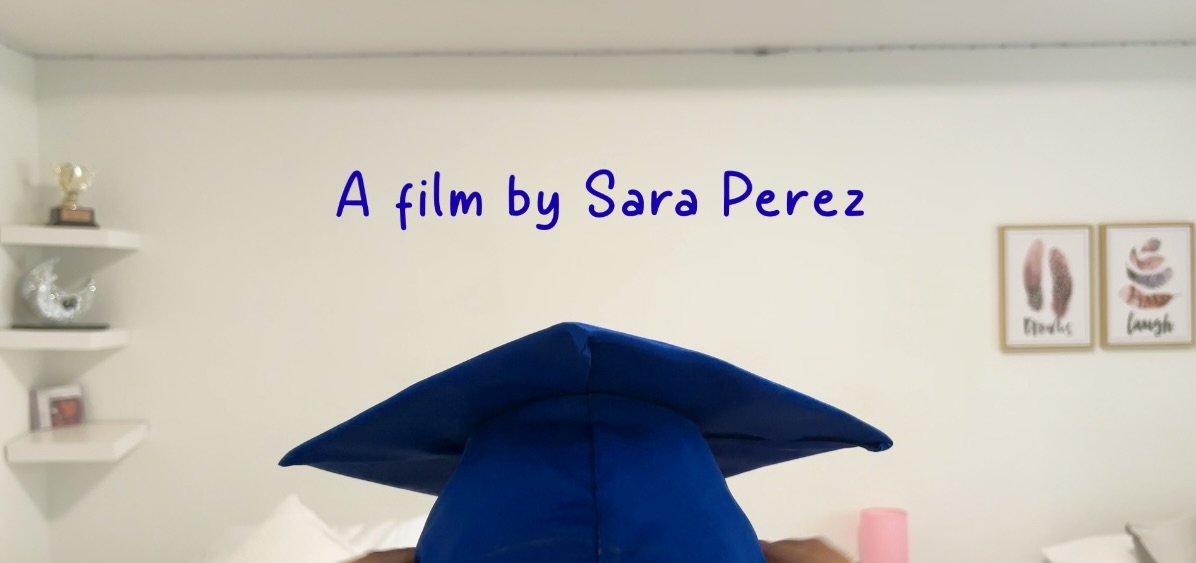
I ended up choosing Savoye LET, I find it so delicate and looks very good in my opinion. I initally planned on using SignPainter, but in some other credits, it looking too much. I also liked Apple Chancery, but I found that Savoye LET looked better. The credits appear in the first part of the opening, when Paula is with her mother with the cap and gown.
Subtitles
Next I will talk about the fonts and colors of the subtitles. I was decided from the beginning of the font. The name of the font is Symbola:
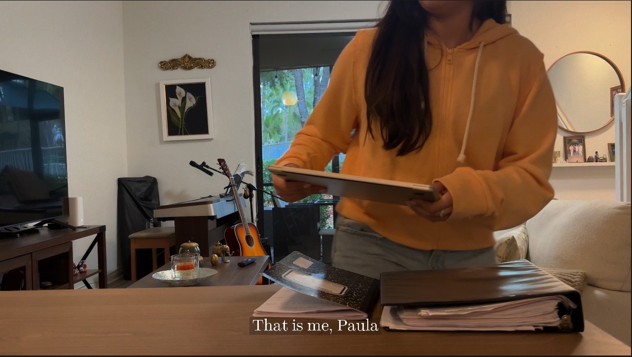
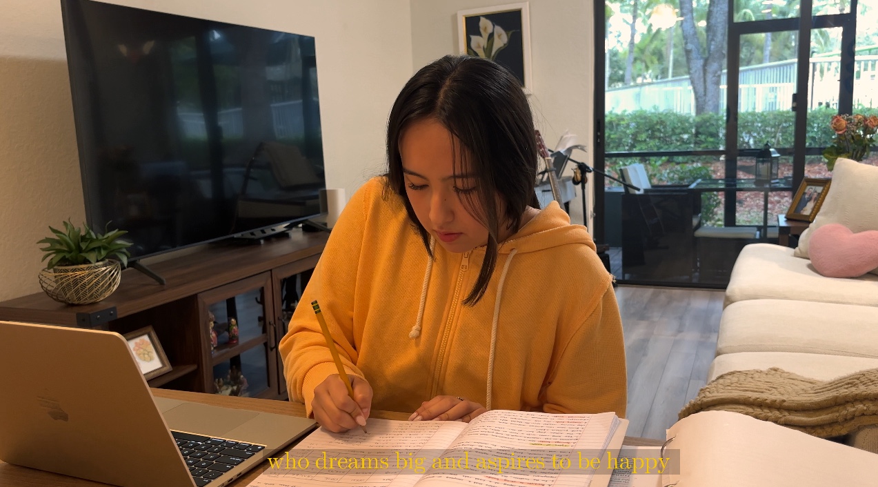
The subtitles are pretty straightforward, however, I wanted to like the font and make it pretty. I choose this font, I liked it and fits into the visuals. I added a slight black background so it can be seen better. I chose the color white, but initially I had put them as yellow. I did this because yellow transmits happiness, and would add to the mood of the narration part. However, in some parts, it was difficult to read like seen in the photo below. It was better to change it to white.
Title


These were ALL the options I liked. However, I ended up doing the last one. I figured that making the font all in capital letters would add emphasis and I just loved how it looked, it looks kind of cinematic, COOLLLL. I like it so much that ended uo doing that one. The font name is Oriya MN.


No comments:
Post a Comment